

The Frame — a tiny piece with a giant job
The right frame can turn a so-so artwork into something appealing, and a good one into something unforgettable. A frame is part engineering, part makeup, part stage lighting: it supports, protects, and quietly guides attention to where it belongs. Get it right and the artwork breathes; get it wrong and even a masterpiece can feel… awkward.If you’ve ever brought a piece home, leaned it against the wall, and wondered, “Why doesn’t it look like it did in the gallery?” — this guide is for you. I’ll keep it practical: sizes, mats, glazing; what works for different media; and pro tricks that save time and money. If you’re just starting your first art collection or learning how to buy art online, framing is the move that turns “just an image” into “the room’s focal point.”

Why framing matters (more than you think)
Framing solves three things at once:
- Protects — from dust, UV, fingerprints, and humidity swings.
- Supports the geometry — paper stays flat, canvas stays square, corners stay safe.
- Presents — gives the eye a clear boundary, like a proscenium where the image “performs.”
“A great frame is invisible. You notice the art — and only later realize the frame was guiding your eye the whole time.”
When frame, mat, and glazing (glass/acrylic, if needed) match the medium, the style, and the room, the piece feels native to the interior — as if it always belonged there.
The anatomy of a good frame (quick tour)
- Frame (moulding). The outer “box” around the work. Materials: wood (warm, tactile), metal (crisp, modern), composites/MDF (budget-friendly). Purpose: sets the style and holds the whole build.
- Mat (passe-partout). The cardboard “border” around the image. Why: lifts glazing off the art, adds breathing room, visually elevates the piece. The mat’s thickness also creates spacing.
- Spacer (distance strips). Thin strips around the inner perimeter. Why: keep glass/acrylic off the surface so nothing touches paint or paper. Variant: with a float mount, the work sits on a backer so its deckled/irregular edges remain visible.
- Glazing. Protective layer — glass or acrylic. Types: standard (affordable, glare-prone), anti-reflective, UV-filtering, and “museum” (max clarity + anti-glare + UV protection).
- Backer & mounting. The support under the artwork and how it’s fixed. Materials: acid-free (archival) foam board/card; linen or Japanese paper hinges. Archival choices are essential for works on paper.

Match the frame’s style to the art (and the room)
Abstract & Contemporary
Photography
Photography thrives on precision: narrow metal frames (matte black, gunmetal, polished aluminum) plus an oversized white mat for that museum vibe. Anti-reflective glass is a game-changer — especially for deep blacks in photography, which can look muddy with glare.
Landscapes & Nature
A warm wood frame echoes organic tones; a deep green or charcoal mat can mirror the palette without stealing the scene. Want a timeless look? Try a slim neutral frame with a generous white mat and let the landscape set the mood.
Minimal, Graphic, or Pop
Minimalism loves restraint: crisp white or black frames, maybe a pencil-thin profile. Pop thrives on contrast — a slim black or bright white frame with a bold mat line feels punchy without slipping into kitsch.
Canvas vs. paper: different rules, different magic
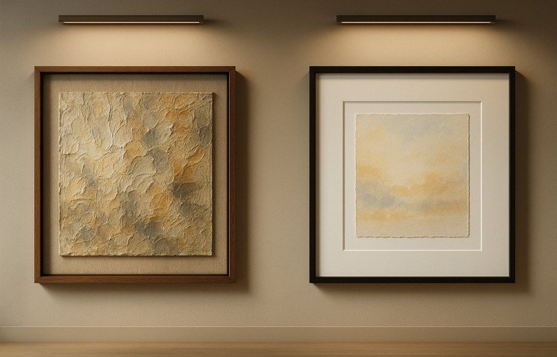
Canvas (oil, acrylic): If the painting is on stretched canvas, you can go frameless (gallery wrap) for a modern studio feel, or use a float frame that leaves a 5–10 mm shadow gap around the edges. Float frames protect texture while keeping air around the paint. If you want a more classical, “statement” look, choose a deep wooden frame with a wide face (30–60 mm) and a deep rabbet 25–40+ mm; you can add an inner liner for a softer transition. Canvas usually doesn’t need glazing, but in public spaces you may use museum/anti-reflective glass or acrylic only with spacers (10–15 mm) so the glazing never touches the impasto (leave a clear air gap above the highest brushstrokes). Materials: oak, walnut, ash (oil/wax, stain, ebonized, veneer, gilding). Mounting: secure the stretcher to the frame/liner and hang on two D-rings and two wall hooks (no center “sag”). A substantial wooden frame suits portraits, realism, and interiors with heavier furnishings; mind the extra weight and hardware.
Paper (watercolor, pastel, prints, drawings): Paper is sensitive. It needs space, a mat, and UV protection. Works on paper should never touch the glazing. Create the gap with spacers or a mat, and make sure anything that touches the art is acid-free/archival. Otherwise acids from cheap board/wood/adhesives migrate into the piece and damage it. Pastel especially benefits from depth so dust can fall away.
Mats 101: when, why, and how much
When to add a mat
- Works on paper (watercolor, graphics, photos) — almost always: protects and adds breathing room between image and glazing.
- Busy/complex compositions — the border calms the eye and “organizes” the picture.
- Small originals — look more important and “museum-like” with a wider mat.
How wide to make it
- Small formats: ~5–7.5 cm (2–3") around.
- Larger frames: ~10–13 cm (4–5").
- Bottom-weighted trick: make the bottom border 1–2 cm wider than the sides — the composition feels steadier.
Rule of thumb: mat width on each side ≈ 10–25% of the artwork’s short edge.
- Smaller works → closer to 20–25% (wider, so it “breathes”).
- Larger works → closer to 10–15% (so the mat doesn’t overwhelm the image).
- Take the short side of the image.
- Multiply by 0.10–0.25 — that’s your per-side mat width range.
- Round to convenient numbers (often in 0.5–1 cm steps).
- Optionally make the bottom +1–2 cm wider (bottom-weighted) for stability.
- 20×30 cm → short side 20 → 2–5 cm → pick 4–5 cm.
- A4 (21×29.7) → short 21 → ~2.1–5.2 cm → 4–5 cm.
- 30×40 cm → short 30 → 3–7.5 cm → 5–6 cm.
- 40×50 cm → short 40 → 4–10 cm → 6–8 cm.
- 50×70 cm → short 50 → 5–12.5 cm → 6–10 cm.
Don’t mix these up: the mat “window” is usually slightly smaller than the image (3–5 mm overlap each side). The numbers above are border widths, not the overlap.
Single, double, or “float”
- Single mat — clean and modern; a universal choice.
- Double mat — a thin inner accent line that echoes the artwork’s color (keep it subtle).
- Float mount — the work sits on top of a backer, deckled/irregular edges stay visible; feels artisanal and airy.
Important: materials must be archival (acid-free, lignin-free). For photographs look for “PAT passed”.
Glazing: “glass or acrylic”
- Standard glass: affordable but heavy and prone to glare.
- Acrylic (plexi): lighter, shatter-resistant, great for large frames and kids’ rooms; can scratch (clean gently).
- Anti-reflective / museum: cuts glare to near zero, adds UV protection, preserves true color. Costs more — but earns its keep in bright rooms.
Big windows or strong overhead light? Anti-reflective glazing turns “nothing but reflections” into “crisp, wow-level clarity.”

Measure like a pro (and skip “almost fits”)
1) Artwork size vs. frame size
- the exact artwork size (to the paper/canvas edge);
- the visible area (mat window). The window is cut 3–5 mm smaller per side so the art doesn’t slip.
2) Aspect ratio
3) Depth (the “layer cake”)
4) Hanging hardware
- use two D-rings on the frame and two wall hooks — it hangs level and won’t drift;
- wire is OK, but for heavy pieces two hooks are steadier;
- check with a level.
If you’re planning a focal-point wall, these tips pair nicely with ideas that turn wall art into a true centerpiece.
Color & material: choosing what suits the room
- Match undertones, not “perfect” color matches. Read the room’s undertone. Warm settings (oak, brass, camel leather) — warm woods/finishes. Cool rooms — black/white/light ash, steel/aluminum. Matte finishes reduce glare.
- Let the art lead. The frame should echo line weight, mood, texture — never overpower them. Minimal photo → slim, crisp profile; textured painting → expressive wood or a float frame.
- When in doubt, go thinner up front. A narrow face looks lighter, dates slower, and doesn’t steal attention. You can keep the frame deep for strength while the face stays slim.
Float frames: the “gallery trick” for canvas
A float frame gives the artwork air: you see the canvas edge and a fine shadow line around it, so the piece feels lighter and more premium. Leave a 5–10 mm gap each side (for heavy impasto: 8–12 mm). Mind depth: the rabbet should comfortably fit the stretcher and hardware; nothing should press on the canvas. Keep colors calm and neutral — natural oak, walnut, black, or white (matte finishes glare less). It’s perfect for contemporary painting and textured abstraction: the frame highlights form and texture without “boxing the picture in.”

Special cases (pastel, charcoal, metal leaf, collage)
- Pastel & charcoal. Nothing should touch the glazing. Use a float mount or a deep mat with spacers so there’s a 6–10 mm air gap. Fixative can be minimal but don’t rely on it — it won’t “glue” dust. A hidden dust trap behind the lower mat edge helps. Ideal glazing — museum/anti-reflective. Store and hang strictly vertical.
- Metal leaf (gold/silver, gilding). Delicate surface; avoid moisture/pressure. Use a float mount on a rigid archival backer, 10–15 mm spacers, and museum glazing (low glare + UV). Only inert/acid-free materials inside the frame; if needed, seal edges with barrier tape. Handle with cotton gloves; don’t touch the face.
- Collage / mixed media. Depth is critical. Choose a shadow box or tall spacers so dimensional elements aren’t crushed. Mounts should be mechanical and reversible: corners, stitches, U-holders, archival hinges; adhesives only if archival and sparing. For heavy elements — separate anchor points. Prefer acrylic glazing (lighter/safer); anti-glare as needed.
DIY or a professional framer?
- DIY when: standard sizes, posters, small prints, experiments. Buy a quality ready-made frame, use archival mat and backer, and if needed swap in anti-reflective/“museum” glazing. Keep all materials acid-free.
- Hire a pro when: valuable work, large format, unusual shape, fragile media (pastel, collage, vintage photos). A framer will pick archival materials, a safe mount (Japanese paper hinges, stitching, holders), calculate depth and spacers, choose glass/acrylic, and assemble everything dead-level.
If you plan to ship the framed piece or store it for a while, many pro-packing tips apply; there’s a quick refresher in our guide on how to package your artwork.
Smart budget: where to spend, where to save
- Worth the spend: anti-reflective/“museum” glazing for photos, works on paper, and anything in bright rooms. Fewer reflections, UV protection, truer color — the difference on the wall is instant.
- Save here: simple profiles instead of ornate mouldings. Slim black, white, or oak-tone frames look “designer” without boutique pricing.
- Smart middle ground: take a ready-made standard frame and add a custom mat (width/color you need). You get a tailored look for a sane price.
- Never skimp on: archival materials that touch the art: acid-free mat/backer, archival hinges. Cheap board and tape will “burn” the paper over time.
- Bonus tip: on a tight budget, upgrade the glazing first rather than the frame profile. Quality glass/acrylic changes the look more than decorative moulding.
Hanging height, spacing, and groupings
- Center height. Aim for the artwork’s center at ~150 cm from the floor (allow 145–155 cm). Hallways/low ceilings: closer to 145–148 cm.
- Above furniture. Leave 15–25 cm between furniture top and frame. Ideally, artwork width ≈ two-thirds of the furniture width.
- Gaps between pieces. Keep 5–8 cm. Tiny pieces: 3–5 cm; large pieces: 8–10 cm. One consistent step within a group.
- Alignment. Choose one rule — top line, bottom line, or a shared center axis — and stick to it.
- Gallery wall. Hang the “anchor” piece first (center ~150 cm), then build around it, keeping the spacing. Paper templates on the wall help a lot.
- Pairs/diptychs/triptychs. 5–8 cm between panels; align along one line (top/bottom/center).
- Hardware. For heavy frames use two wall hooks and two D-rings: it holds level better.
Sketch a few layouts and preview how styles sit together. A quick primer: the most famous art styles & movements.
Quick decisions by medium (bookmark this)
Oil / acrylic on canvas
- Frame: float frame (5–10 mm gap) or deep wooden moulding.
- Glazing: usually not needed; if required in public spaces, only with 10–15 mm spacers.
- Protection: final varnish for painting.
Watercolor / gouache / ink (on paper)
- Frame: mat + spacers.
- Glazing: UV/anti-reflective (museum/AR).
- Mounting: archival Japanese paper hinges / starch paste.
- Materials: acid-free; for photos — PAT passed (buffered mat is fine for watercolor).
Pastel / charcoal
- Mount: float or deep mat + 6–10 mm spacers (never touch the glazing).
- Glazing: museum/anti-glare. A “dust trap” behind the lower mat edge helps.
- Display: strictly vertical.
Photography
- Frame: thin metal or thin wood.
- Mat: wide white (for that museum look).
- Glazing: anti-reflective with UV.
- Materials: archival only; PAT passed for photos.
Prints (etching, lino, screenprint)
- Mount: float (show margins/deckle) or mat.
- Glazing: UV/anti-glare.
- Signature/edition: keep margins visible; don’t crop.
- Mounting: reversible, archival.
Quick mat guide
- Small formats: 5–7.5 cm
- Large: 10–13 cm
- Bottom can be +1–2 cm wider.
Always important
- All internals — acid-free / lignin-free; seal raw wood inside with barrier tape.
- Heavy frames — 2 D-rings + 2 wall hooks.
Common mistakes (and how to avoid them)
- Mat too narrow. The art feels cramped. Aim for borders ≈ 10–25% of the short edge; bottom can be +1–2 cm.
- Glossy glass in a bright room. Glare eats detail. Pick anti-reflective/museum glazing.
- Cropping signatures/edition. Always measure the live area; cut the mat window 3–5 mm smaller than the image, and if the signature is on the margin, use a float mount so margins stay visible.
- Wire + single hook on a heavy frame. Risk of tilt and fall. Use 2 D-rings and 2 wall hooks (anchors for very heavy pieces).
- Ignoring humidity. Bathrooms/kitchens are risky for paper. Keep RH 40–55%, avoid steam, leave a small gap behind the frame, and seal the back with a dust cover/barrier tape.
Care & maintenance
Dust with a soft microfiber cloth; never spray cleaner directly on glazing (spray the cloth, then wipe). For acrylic, use only plastic-safe cleaner. Periodically check hardware — big frames settle over time. Sunlight wins every slow battle: UV glazing buys you time, but avoid direct rays when you can.Final thought
Framing is a love language for art. You give the piece structure, protection, and a stage. Whether it’s a quiet watercolor, a bold abstract, or a striking photograph — the right mix of moulding, mat, and glazing makes viewers lean in and stay longer.
I hope I didn’t overwhelm you with details — I tried to keep it concise while leaning on my own practice and widely recognized professional standards. I’d be grateful for your comments.
And yes — if your heart’s been nudging you to frame that special piece, listen to it.